
In today’s digital age, your business website is often the first impression potential customers have of your brand. It’s not just about having a presence online; it’s about making that presence count. A well-designed website can be your most powerful marketing tool, attracting visitors, converting them into leads, and ultimately driving sales. But where do you start when it comes to creating a website that truly works for your business? This is where understanding effective website layout ideas for businesses becomes crucial. A smart layout guides your visitors, showcases your offerings, and builds trust. Let’s dive into how you can craft a website that not only looks good but also performs exceptionally well.
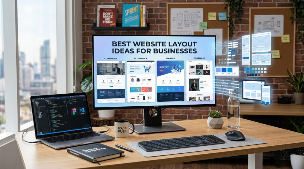
Smart Website Layout Ideas for Business
What is a Website Layout?
At its core, a website layout is the arrangement of elements on your web pages. Think of it as the blueprint of your online space. This includes where your logo sits, how your navigation menu is structured, where images and text are placed, and how different sections of your site are organized. It’s about creating a visual hierarchy that makes it easy for users to find what they’re looking for and understand your message. A good layout isn’t just about aesthetics; it’s fundamentally about user experience (UX) and usability. It dictates how someone interacts with your site, influencing their journey from arrival to conversion.
A well-thought-out website layout considers the flow of information and the user’s path. It anticipates what a visitor might want to do next and makes it as seamless as possible. This involves strategic placement of calls to action (CTAs), clear labeling of navigation, and a logical grouping of content. For instance, a product page layout will differ significantly from a blog post layout. The former needs prominent “add to cart” buttons and clear product descriptions, while the latter prioritizes readability and shareability. Ultimately, a strong layout is the invisible hand that guides your visitors through your digital storefront.
In essence, the layout is the structural foundation of your website’s design. It’s the underlying framework that supports all the visual content and interactive elements. Without a coherent layout, even the most beautiful graphics or compelling copy can get lost, leaving users confused and frustrated. Therefore, investing time and thought into your website’s layout is not an optional step; it’s a fundamental requirement for online success. It’s about creating an intuitive and engaging environment that reflects your brand’s professionalism and makes it easy for customers to do business with you and makes you to learn website layout ideas for businesses.
Why Website Layout Ideas for Businesses Matter So Much
The importance of a well-executed website layout for businesses cannot be overstated. In a competitive online landscape, first impressions are critical. A cluttered, confusing, or outdated layout can send visitors running to your competitors within seconds. Conversely, a clean, intuitive, and visually appealing layout builds immediate trust and credibility. It signals that you are professional, organized, and care about your customers’ experience. This initial trust is the bedrock upon which all further customer engagement is built, making your website a valuable asset rather than a missed opportunity and shows website layout ideas for businesses.
Moreover, effective website layout ideas directly impact user engagement and conversion rates. When visitors can easily navigate your site, find the information they need, and understand your offerings, they are far more likely to stay longer, explore more pages, and ultimately take the desired action, whether that’s making a purchase, filling out a contact form, or signing up for a newsletter. A logical flow, clear calls to action, and well-organized content all contribute to a positive user experience that encourages these valuable conversions.
Beyond direct conversions, a strong website layout also plays a vital role in your Search Engine Optimization (SEO). Search engines like Google favor websites that provide a good user experience. This includes factors like easy navigation, fast loading times (often influenced by layout efficiency), and clear content organization. A well-structured layout helps search engine bots crawl and index your site more effectively, leading to higher rankings in search results and increased organic traffic. Therefore, focusing on smart website layout ideas for businesses is a strategic investment that yields returns across multiple fronts, from customer acquisition to brand perception.
Step-by-Step Guide to Crafting Your Business Website Layout
1. Define Your Goals and Target Audience: Before you even think about where to put your navigation bar, you need to understand what you want your website to achieve and who you’re trying to reach. Are you aiming to sell products directly, generate leads, provide information, or build a community? Who is your ideal customer? Understanding their needs, preferences, and online behavior will heavily influence your layout decisions. For example, a B2B service business might prioritize a professional, information-rich layout, while an e-commerce store will focus on product presentation and a streamlined checkout process.
2. Map Out Your Content and Key Pages: Once your goals are clear, list all the essential information and features your website needs. This typically includes a homepage, about us page, services/products page, contact page, blog, and potentially a portfolio or testimonials section. Think about the hierarchy of information. What’s the most important message you want to convey on each page? Sketch out a sitemap – a visual representation of your website’s structure – to ensure a logical flow between pages. This early planning prevents later headaches and ensures all necessary components are accounted for website layout ideas for businesses.
3. Choose a Layout Structure and Wireframing: Now you can start thinking about the actual arrangement. Common layout structures include the classic header-content-footer, single-column, multi-column, and grid layouts. For your homepage, consider a hero section (a prominent banner or image at the top), followed by sections showcasing key services, testimonials, and a clear call to action. Wireframing is the next crucial step; it’s like creating a skeletal outline of each page, focusing on the placement of elements like navigation, headlines, images, and buttons without getting bogged down in colors or fonts. Tools like Balsamiq, Figma, or even pen and paper can be used for this shows website layout ideas for businesses.
Proven Business Website Layout Approaches
The Hero Section: Making a Powerful First Impression
The hero section is the very first thing visitors see when they land on your homepage. It’s prime real estate and needs to be impactful. A well-designed hero section typically includes a compelling headline that clearly states what you do or the main benefit you offer, a strong visual (image or video) that reinforces your message, and a prominent call to action (CTA) that guides users on what to do next. Think of it as your digital handshake; it needs to be welcoming, informative, and persuasive. For instance, a software company might use a hero section with a headline like “Streamline Your Workflow,” a screenshot of their intuitive dashboard, and a “Request a Demo” button.
The effectiveness of a hero section lies in its clarity and relevance. Visitors should instantly understand the purpose of your website and what value you provide. Avoid jargon or overly generic statements. Instead, focus on the core benefit for your target audience. The visual element should be high-quality and aligned with your brand identity. It could be a professional photograph, an engaging illustration, or a short, impactful video. The CTA should be clear, action-oriented, and strategically placed to encourage immediate engagement.
A common mistake is to cram too much information into the hero section. Keep it concise and focused. The goal is to pique interest and encourage further exploration, not to overwhelm the visitor. Another pitfall is using a generic or irrelevant image that doesn’t resonate with your brand or audience. Always ensure your hero section is tailored to your specific business and the needs of your potential customers and make sure the website layout ideas for businesses.
Navigation: Guiding Your Users Effortlessly
Your website’s navigation is its roadmap. If it’s confusing or difficult to use, visitors will get lost and frustrated, leading to high bounce rates. The primary navigation menu, usually located at the top of the page, should be clear, concise, and consistently placed across all pages. Use simple, descriptive labels for your menu items, such as “Services,” “About Us,” “Products,” and “Contact.” Avoid ambiguous terms or internal company jargon that your customers won’t understand.
Beyond the main menu, consider incorporating secondary navigation elements. This could include a footer navigation that lists important links like privacy policy, terms of service, and sitemaps, or contextual navigation within specific pages that helps users delve deeper into a topic. For e-commerce sites, clear product categorization and filtering options are essential for effective navigation. Think about how users will move through your site; make it intuitive and logical.
A user-friendly navigation system is paramount for a positive user experience. It should be accessible on all devices, including mobile phones and tablets. Responsive design ensures your navigation adapts seamlessly to different screen sizes. For businesses with a large amount of content, consider using mega menus or dropdowns, but ensure they are well-organized and don’t become overwhelming. The ultimate goal is to make it effortless for visitors to find exactly what they’re looking for, encouraging them to stay and engage with your content and makes website layout ideas for businesses.
Content Layout: Presenting Information Effectively
The way you lay out your content is crucial for readability and engagement. Large blocks of text can be intimidating and lead to visitors scanning rather than reading. Break up your content using headings, subheadings, bullet points, and short paragraphs. This creates visual breathing room and makes it easier for users to digest information quickly. Use clear, concise language and focus on the benefits for your audience.
Visual elements are also key to an effective content layout. Incorporate high-quality images, videos, infographics, and charts to illustrate your points, break up text, and make your content more engaging. For example, instead of just describing a service, include an image or a short video demonstrating it in action. This not only makes your content more appealing but also helps visitors understand complex information more easily.
Strategic placement of calls to action (CTAs) within your content is also vital. Don’t wait until the end of a page to tell visitors what to do next. Sprinkle relevant CTAs throughout your content. For instance, after describing a specific service, you might include a button that says “Learn More About This Service” or “Get a Quote.” This encourages users to take the next step in their journey with your business without having to scroll back to the top and which shows website layout ideas for businesses.
Call to Action (CTA) Placement: Driving Conversions
Your website’s ultimate goal is often to drive a specific action from your visitors. This is where strategically placed Call to Action (CTA) buttons come into play. CTAs are prompts that encourage users to take a desired step, such as “Buy Now,” “Sign Up,” “Download,” or “Contact Us.” Their placement is critical for guiding users through the conversion funnel. Prominent CTAs should be easily visible and stand out from the surrounding content, often using contrasting colors and clear, action-oriented text.
Consider placing CTAs in multiple strategic locations. The hero section is a prime spot for a primary CTA. Within your service or product pages, CTAs should be present near the descriptions and pricing. On your “About Us” page, a CTA like “Request a Consultation” can be effective. Even in blog posts, relevant CTAs can encourage further engagement with your offerings. Think about the user’s journey on each page and place CTAs where they naturally fit and make sense.
The design and wording of your CTAs are just as important as their placement. They should be clear, concise, and benefit-driven. Instead of a generic “Click Here,” try something like “Start Your Free Trial” or “Get Your Custom Quote.” Visually, CTAs should be buttons that are large enough to be easily clicked, especially on mobile devices. They need to be compelling enough to entice users to take that next step towards becoming a customer and shows them website layout ideas for businesses.
Mobile Responsiveness: Designing for Every Screen
In today’s mobile-first world, a responsive website design is no longer optional; it’s a necessity. This means your website layout should automatically adapt and adjust to fit any screen size, from a large desktop monitor to a small smartphone. If your website isn’t responsive, visitors on mobile devices will encounter a frustrating experience with tiny text, difficult navigation, and content that’s hard to read or interact with. This can lead to immediate abandonment and lost business opportunities.
A responsive layout ensures a consistent and positive user experience regardless of the device being used. Navigation menus should transform into mobile-friendly versions, images should resize appropriately, and content should remain easily readable and accessible. This adaptability is crucial for retaining visitors, encouraging engagement, and ultimately driving conversions. Google also prioritizes mobile-friendly websites in its search rankings, so responsiveness is a key factor for SEO.
When designing or updating your website layout, always prioritize mobile responsiveness from the outset. Test your design on various devices and screen sizes to ensure everything looks and functions as intended. Consider a “mobile-first” design approach, where you design for the smallest screens first and then progressively enhance the layout for larger screens. This ensures that your core content and functionality are accessible and usable even on limited mobile displays.
White Space and Visual Hierarchy: Creating Clarity
White space, also known as negative space, is the empty area around elements on your web page. It’s not wasted space; it’s a powerful design tool. Strategic use of white space makes your content easier to read, reduces cognitive load, and draws attention to important elements. It helps to create a clean, uncluttered, and professional look. Think of it as giving your content room to breathe.
Visual hierarchy is about arranging elements on your page in order of importance. This guides the visitor’s eye through the content in the way you intend. Larger fonts for headlines, bolder text for key phrases, and the strategic placement of images all contribute to establishing a clear visual hierarchy. The most important information should be the most prominent. This ensures that your visitors can quickly scan the page and grasp the essential message.
Combining white space and visual hierarchy creates a harmonious and effective layout. When important elements are given ample white space and are presented with a clear visual hierarchy, they stand out and are more likely to be noticed and acted upon. This not only improves the user experience but also makes your marketing messages more impactful. For instance, a key benefit of your service placed in a prominent area with plenty of white space will grab attention far more effectively than if it were buried in a dense block of text.
Testimonials and Social Proof: Building Trust
Incorporating testimonials and social proof is a highly effective strategy for building trust and credibility with potential customers. When visitors see that others have had positive experiences with your business, they are more likely to feel confident in choosing you themselves. This can include customer reviews, ratings, case studies, client logos, and social media mentions. These elements act as endorsements from real people, validating your claims and reducing perceived risk.
The layout for presenting testimonials can vary. You might have a dedicated “Testimonials” page, or you can sprinkle them strategically throughout your website. Consider featuring a few standout testimonials on your homepage, perhaps in a visually appealing slider or card format. Including a photo of the customer or their company logo, along with their name and title, adds authenticity and makes the testimonial more impactful and makes a different types of website layout ideas for businesses.
Social proof goes beyond just written testimonials. Displaying the number of satisfied customers, awards won, or media mentions can also significantly boost credibility. For example, a small business might showcase logos of well-known clients they’ve worked with. An e-commerce site could highlight the number of products sold or positive reviews received. These elements, when presented clearly and accessibly within your website layout, act as powerful trust signals that can sway undecided visitors.
Tips and Best Practices for Website Layouts
Keep it Simple and Focused
In website design, less is often more. A cluttered layout overwhelms visitors and makes it difficult to find what they’re looking for. Focus on a clean, minimalist design that highlights your core message and offerings. Prioritize essential elements and remove anything that doesn’t serve a clear purpose. This simplicity extends to your navigation; ensure it’s intuitive and easy to use. A focused layout guides users effectively and creates a more pleasant browsing experience.
When thinking about content, break it down into digestible chunks. Use headings, subheadings, bullet points, and short paragraphs to improve readability. Avoid large blocks of text that can be intimidating. Instead, use visuals like images, videos, and infographics to illustrate your points and make your content more engaging. Every element on your page should have a purpose and contribute to the overall user experience and your business goals
Simplicity also applies to your calls to action. Make them clear, concise, and easy to understand. Avoid ambiguous language. A well-placed, straightforward CTA is far more effective than a confusing or buried one. By keeping your website layout simple and focused, you create a more professional and user-friendly experience that encourages visitors to stay, engage, and convert into website layout ideas for businesses.
Ensure Consistency Throughout
Consistency in your website layout is key to building a strong brand identity and providing a seamless user experience. This means using the same fonts, color schemes, spacing, and element placement across all pages of your website. For example, your navigation menu should appear in the same location and style on every page. The way you present headings, body text, and buttons should also be uniform.
This consistency helps users build familiarity with your site. Once they understand how your navigation works or how to find information, they can navigate your entire website with confidence. Inconsistency, on the other hand, can be jarring and confusing, leading to frustration and a higher likelihood of users leaving your site. It also undermines your brand’s professionalism and can make your business appear less credible.
Think of your website as a cohesive experience, not a collection of disparate pages. Every element, from your logo to your footer, should reinforce your brand identity and contribute to a unified whole. This commitment to consistency extends to your mobile experience as well. Ensure your responsive design maintains the same visual language and user flow across all devices.
Prioritize User Experience (UX)
User Experience (UX) should be at the forefront of all your website layout decisions. This means designing your website with the needs and expectations of your users in mind. A good UX is intuitive, efficient, and enjoyable. It’s about making it easy for visitors to accomplish their goals on your site, whether that’s finding information, making a purchase, or contacting you.
Key aspects of UX design include clear navigation, fast loading times, mobile responsiveness, and accessible content. Users should be able to find what they’re looking for quickly and without frustration. Important information should be readily available, and the overall process of interacting with your website should feel natural and effortless.
Testing your website with real users is an invaluable way to identify UX issues. Gather feedback on their experience, observe how they interact with your site, and use this information to make improvements. Remember, a positive user experience not only keeps visitors engaged but also builds trust and encourages them to return. It’s a critical factor in converting visitors into loyal customers.
Make it Accessible
Accessibility in web design means ensuring that your website can be used by everyone, including people with disabilities. This is not only an ethical consideration but also a legal requirement in many regions, and it can significantly expand your potential audience. Designing for accessibility benefits all users by creating a more robust and user-friendly website.
This involves several practices:
- Alt Text for Images: Provide descriptive alt text for all images so screen readers can convey the image’s content to visually impaired users.
- Keyboard Navigation: Ensure your entire website can be navigated using only a keyboard, which is essential for users who cannot use a mouse.
- Color Contrast: Use sufficient color contrast between text and background to make content readable for users with visual impairments.
- Clear Headings and Structure: Use proper heading tags (H1, H2, H3, etc.) to create a logical document structure that screen readers can interpret.
- Captions for Videos: Provide captions for all video content to benefit deaf or hard-of-hearing users, as well as those in noisy environments.
Implementing these accessibility features often aligns with good SEO practices, as search engines also benefit from well-structured and clearly described content. By prioritizing accessibility in your website layout, you create a more inclusive and user-friendly experience for everyone and makes website layout ideas for businesses.
Common Mistakes to Avoid in Website Layouts
Overcrowding and Clutter
One of the most common and detrimental mistakes is overcrowding your website with too much information, too many images, or too many competing calls to action. A cluttered layout overwhelms visitors, making it difficult for them to focus on what’s important. This can lead to confusion, frustration, and a high bounce rate. Imagine walking into a physical store that’s overflowing with merchandise and no clear aisles – it’s an unpleasant experience.
Instead of trying to cram every piece of information onto a single page, focus on creating a clear hierarchy and using white space effectively. Break down complex information into smaller, digestible sections. Prioritize your most important messages and CTAs, and ensure they are easily discoverable. A clean, organized layout is far more effective at guiding users and achieving your business objectives.
This mistake often stems from a desire to showcase everything a business offers. However, it’s more effective to guide users through a curated journey. Use clear navigation to help them explore different sections, and within each section, present information logically and concisely. Remember, a user who can easily find what they need is much more likely to convert than one who is lost in a sea of visual noise.
Inconsistent Design Elements
Inconsistency in design elements is another pitfall that can significantly harm your website’s credibility and user experience. This includes using different fonts, color palettes, button styles, or spacing across various pages. When your website looks and feels different from one page to the next, it creates a disjointed experience for the user. They may start to question the professionalism and stability of your brand.
A consistent design reinforces your brand identity and makes your website feel cohesive and trustworthy. For example, if your primary call to action button is red on one page and blue on another, users might become confused about which actions are most important or even question the legitimacy of the different buttons. This lack of uniformity can lead to reduced engagement and a higher bounce rate.
To avoid this, create a style guide for your website that outlines all the visual elements. This guide should specify your brand colors, typography, button styles, spacing rules, and image guidelines. Adhering to this style guide ensures that every page of your website presents a unified and professional image, making it easier for users to navigate and trust your brand and makes website layout ideas for businesses.
Neglecting Mobile Users
In our mobile-dominated world, failing to design with mobile users in mind is a critical error that can cripple your business’s online presence. If your website layout isn’t responsive, meaning it doesn’t adapt seamlessly to different screen sizes, mobile visitors will likely have a poor experience. They might encounter tiny text that’s impossible to read, buttons that are too small to tap, and content that requires excessive zooming and scrolling.
This leads to immediate frustration, and users will quickly abandon your site in favor of a competitor’s that offers a better mobile experience. This is especially damaging for businesses that rely on local searches or on-the-go customers. Moreover, search engines like Google penalize non-mobile-friendly websites in their search rankings, making it harder for potential customers to find you.
Prioritizing mobile responsiveness means ensuring your navigation is touch-friendly, your content is easily readable, and your CTAs are prominent and clickable on smaller screens. Consider a mobile-first design approach, where you build the core experience for mobile and then enhance it for larger screens. This ensures that your website is accessible and effective for the majority of your potential audience.
Poorly Placed or Unclear Calls to Action
Your website layout should strategically guide visitors towards desired actions, and effective Call to Actions (CTAs) are the engine for this. A common mistake is to have CTAs that are poorly placed, making them hard to find, or unclear in their purpose. If a user doesn’t understand what clicking a button will do, or if it’s buried beneath other content, they are unlikely to engage with it.
CTAs need to be visually prominent, using contrasting colors and clear, action-oriented language. They should be placed at logical points within your content where a user might be ready to take the next step. For example, after describing a service, a CTA to “Request a Quote” is appropriate. On a product page, an “Add to Cart” button is essential.
Another mistake is having too many competing CTAs on a single page, which can confuse users. Prioritize your primary CTA for each page and ensure it stands out. Secondary CTAs can be present but should be visually distinct and less prominent. The goal is to guide users smoothly through their journey without overwhelming them with choices.
Ignoring User Feedback and Testing
One of the biggest mistakes businesses make is launching a website and assuming the layout is perfect without ever gathering feedback or conducting tests. Your perception of your website might be different from that of your actual users. What seems intuitive to you might be confusing for someone unfamiliar with your brand or industry.
Actively seeking user feedback through surveys, usability testing, or even informal conversations can reveal crucial insights into how your layout is performing. Watching users interact with your site can highlight areas where they get stuck, confused, or frustrated. This real-world data is invaluable for identifying and fixing layout issues that you might otherwise miss.
A/B testing is another powerful tool for optimizing your layout. By presenting different versions of a page element (like a CTA button’s color or placement) to different segments of your audience, you can determine which version performs best. Continuously testing and iterating based on user feedback and data ensures that your website layout evolves to meet user needs and business goals effectively.
Conclusion
Crafting an effective business website layout is a strategic process that goes far beyond aesthetics. It’s about creating an intuitive, engaging, and conversion-focused experience for your visitors. By understanding the fundamental principles of layout design, embracing proven approaches like strong hero sections and clear navigation, and prioritizing user experience, you can build a website that not only looks great but also drives tangible results for your business. Remember to keep your design simple, consistent, and accessible, and always be willing to gather feedback and iterate. Implementing these website layout ideas for businesses will empower you to make a powerful first impression, guide your audience effectively, and ultimately achieve your online objectives.
FAQ: Website Layout Ideas for Businesses
Q1: How do I choose the right layout structure for my business website?
The best layout structure depends on your business type and goals. For a service-based business, a clean, information-rich layout with clear calls to action for consultation or inquiry might be best. An e-commerce business will benefit from a layout that prioritizes product display, easy navigation, and a streamlined checkout process. Consider your target audience and their typical online behavior. Generally, a well-defined hero section, clear navigation, and organized content blocks are universally effective.
Q2: What is the importance of a hero section in a business website layout?
The hero section is the first visual element visitors see on your homepage. It’s your prime real estate to make a strong first impression. A well-designed hero section should immediately communicate what your business offers, its primary value proposition, and guide visitors with a clear call to action. It’s crucial for grabbing attention, conveying your message quickly, and encouraging users to explore further.
Q3: How can I ensure my website layout is mobile-friendly?
Ensuring mobile-friendliness involves using a responsive design approach. This means your website’s layout automatically adjusts to fit any screen size. Key elements to consider include touch-friendly navigation, readable font sizes, appropriately sized images, and easily clickable buttons on smaller screens. Test your website on various mobile devices to ensure a seamless experience, and consider a mobile-first design strategy.
Q4: How often should I update my website layout?
While you don’t need to overhaul your layout constantly, it’s good practice to review and update it periodically. Aim for a comprehensive review every 1-3 years, or sooner if your business goals change, your target audience evolves, or you notice a decline in user engagement or conversion rates. Regularly updating your layout based on user feedback and analytics ensures it remains effective and aligned with current web design trends and user expectations.

