
Ever found yourself staring at a website, mesmerized by its beauty, and wondered, “How did they get those colors to work so well together?” The secret often lies in carefully chosen colour combinations for websites. It’s not just about picking pretty shades; it’s about creating a visual language that speaks to your audience and guides them through your digital space. For beginners, this can feel a bit daunting, but understanding the basics of color theory and how it applies to web design can unlock a world of possibilities, transforming a drab page into a captivating experience in Website Color Combos.
Choosing Website Color Palettes: website colour combination
At its core, Website Color combinations refers to the strategic selection and arrangement of different colors used throughout a website’s design. Think of it as building a visual harmony that extends from your logo and branding to your buttons, text, and background images. These combinations aren’t random; they are carefully considered to evoke specific emotions, convey a brand’s personality, and ensure a positive user experience. Whether it’s a bold and energetic palette or a calming and sophisticated one, the chosen colors work together to create a cohesive and impactful aesthetic.
The effectiveness of these combinations goes beyond mere aesthetics. They play a crucial role in how visitors perceive your brand and interact with your content. A well-thought-out color scheme can make your website feel professional, trustworthy, and inviting, or it can inadvertently make it feel cluttered, confusing, or even off-putting. Understanding the psychology behind colors and how they influence perception is a key part of mastering website color palettes, ensuring your chosen combinations achieve your desired outcomes.
Ultimately, Website Color combinations are about creating a visual identity that is both appealing and functional. They are the silent storytellers of your brand, guiding the user’s eye, highlighting important information, and leaving a lasting impression. Mastering this aspect of web design is an essential step for anyone looking to create a successful and engaging online presence.
Why are Colour Combinations for Websites Important?
The importance of well-chosen website color combinations cannot be overstated. Colors have a profound psychological impact on us, influencing our moods, emotions, and even our purchasing decisions. For a website, this means that the colors you choose can directly affect how visitors feel about your brand and their willingness to engage with your content or products. A harmonious color palette can create a sense of trust and professionalism, encouraging visitors to stay longer and explore further.
Furthermore, effective website color combinations are essential for creating a clear visual hierarchy and improving user experience. By using contrasting colors, you can draw attention to important elements like call-to-action buttons, headlines, and key information. This helps users navigate your site more easily, find what they’re looking for, and complete desired actions, ultimately leading to higher conversion rates. Conversely, poorly chosen or clashing colors can lead to confusion, eye strain, and a frustrating user experience, causing visitors to leave your site prematurely.
Beyond usability, Website Color combinations are a powerful tool for brand recognition and differentiation. A consistent and distinctive color scheme helps your brand stand out in a crowded digital landscape, making it memorable and easily identifiable. When users see your brand colors, they should instantly associate them with your business, reinforcing your brand identity and building a stronger connection with your audience.
Easy Color Combos for Your Site
Step-by-Step Guide to Choosing Website Color Palettes
Embarking on the journey of selecting Website Color combinations might seem complex, but a structured approach can simplify the process. Begin by defining your brand’s personality and the emotions you want to evoke. Are you aiming for a feeling of trust and stability, perhaps using blues and grays? Or do you want to convey energy and excitement, leaning towards oranges and yellows? Understanding your core message is the foundational step.
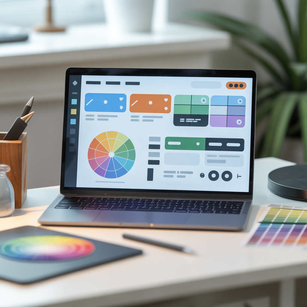
Next, consider your target audience. Different demographics and interests might respond better to certain color schemes. Researching what colors resonate with your ideal visitor can offer valuable insights. Once you have a clear understanding of your brand and audience, you can start exploring color theory. Familiarize yourself with the color wheel and basic color relationships like complementary, analogous, and triadic schemes, which will provide a framework for creating visually pleasing Website Color combinations.
Websites Color Combos. Finally, leverage online tools and resources. Websites like Coolors, Adobe Color, and Canva offer color palette generators and inspiration galleries that can help you visualize different combinations. Don’t be afraid to experiment! Create a few different palettes and see how they look on mockups of your website. Gather feedback from others, and trust your instincts to arrive at the Website Color combinations that best represent your brand and serve your users.
When it comes to creating effective colour combinations for websites, certain pairings have stood the test of time due to their inherent appeal and psychological impact. A classic and widely trusted combination is Blue and White. Blue often evokes feelings of trust, calmness, and professionalism, making it a perennial favorite for corporate sites, financial institutions, and healthcare providers. Paired with white, it creates a clean, crisp, and airy feel that is easy on the eyes and promotes readability.
Another highly effective and versatile choice is Green and White/Beige. Green is strongly associated with nature, growth, health, and harmony. This makes it ideal for environmental organizations, health and wellness brands, or any business aiming for a natural or organic feel. When combined with white or soft beige, it creates a serene and refreshing aesthetic, reinforcing the brand’s connection to natural elements and promoting a sense of well-being.
For a more energetic and modern feel, consider Orange and Dark Gray/Black. Orange is a vibrant and enthusiastic color that can convey creativity, warmth, and friendliness. Paired with a sophisticated dark gray or black, it creates a striking contrast that grabs attention without being overwhelming. This combination is excellent for tech startups, creative agencies, or businesses looking to convey innovation and approachability.
Tips for Using Color Effectively
When implementing colour combinations for websites, remember that balance is key. Don’t overwhelm your users with too many competing colors. A good rule of thumb is to stick to a primary color, a secondary color, and an accent color. Your primary color will dominate the design, setting the overall tone. The secondary color will complement the primary and be used for larger elements, while the accent color should be used sparingly to highlight crucial interactive elements like buttons and links, making them pop.
Consider contrast and readability when selecting your Website Color combinations. Ensure that your text color has sufficient contrast against its background color to make it easy for users to read. Poor contrast can lead to eye strain and make your content inaccessible to many users, especially those with visual impairments. Tools like contrast checkers can help you verify that your chosen combinations meet accessibility standards.
Finally, consistency is paramount for strong Website Color combinations. Once you’ve established your brand’s color palette, use it consistently across all your digital platforms. This includes your website, social media profiles, email marketing, and any other online presence. Consistent use of color reinforces brand recognition, builds trust, and creates a seamless user experience, making your brand instantly recognizable and memorable.
Common Mistakes to Avoid
One of the most common mistakes beginners make with Website Color combinations is using too many colors. While it might seem like a way to make your site more vibrant, an overabundance of colors can quickly lead to a cluttered, unprofessional, and confusing design. It dilutes your brand message and makes it difficult for users to focus on what’s important. Stick to a limited palette, usually 2-3 main colors with an accent, to maintain a cohesive and visually appealing look.
Another pitfall is neglecting contrast and readability. Choosing colors that look good together in isolation doesn’t guarantee they’ll work well on a live website. If your text is hard to read against its background, visitors will struggle to engage with your content. This is particularly true for call-to-action buttons, which need to stand out clearly. Always test your color choices for legibility, especially for essential elements, to ensure your Website Color combinations are functional.
Lastly, many beginners fail to consider the emotional impact of colors. Different colors evoke different feelings, and choosing a palette that clashes with your brand’s message can be detrimental. For instance, using bright, playful colors for a serious financial institution might create a disconnect. Research the psychology of color and ensure your chosen Website Color combinations align with the emotions and brand identity you want to communicate to your audience.
Conclusion
Mastering colour combinations for websites is a journey, not a destination, and for beginners, it’s about building a solid foundation. By understanding the principles of color theory, considering your brand and audience, and using practical tools, you can move from guesswork to strategic design. Remember to keep it simple, prioritize readability and contrast, and always strive for consistency. The right color palette can transform your website from a simple online presence into a powerful brand experience that captivates, engages, and converts.
So, there you have it – a beginner’s guide to navigating the vibrant world of website color combinations. It’s not about being an art school graduate; it’s about understanding how colors work together to tell your story and connect with your visitors. Armed with these insights, you’re well on your way to crafting a website that not only looks fantastic but also functions beautifully, leaving a lasting positive impression. Happy designing!
FAQ
What is the best color combination for a website?
There’s no single “best” color combination for every website, as it heavily depends on your brand, target audience, and the message you want to convey. However, blue and white is a classic for trust and professionalism, green and beige for nature and health, and orange and dark gray for energy and modernity. Always consider the psychology of colors and test them for readability and user experience.
How do I choose colors for my website if I have no design experience?
Start by identifying your brand’s personality and the emotions you want to evoke. Use online color palette generators like Coolors or Adobe Color, which offer pre-made palettes and inspiration based on popular trends or specific moods. Focus on a primary, secondary, and accent color, and always prioritize readability and contrast, especially for text and call-to-action buttons.
How many colors should I use on my website?
For most websites, it’s best to stick to a limited color palette. Aim for 2-3 main colors and one accent color. This helps create a cohesive and professional look. Too many colors can make your website look cluttered and confusing, detracting from your brand message and user experience.
What are complementary colors and how can I use them?
Complementary colors are colors that are directly opposite each other on the color wheel, such as blue and orange, or red and green. They create a strong contrast and high visual energy when used together. For websites, complementary colors are often best used as an accent color against a more neutral background to draw attention to key elements like buttons or important links, making them pop without overwhelming the user.